The Future of Virtual Reality: On the Design of Valve’s The Lab
Welcome to The Future of Virtual Reality, a new series coming out of our R&D department, Rafael Lino, our post-production specialist shares his insight into how good design plays a crucial role in successful virtual reality games and experiences.
In a company where everyone can choose to work on whatever they want, it’s revealing that Valve has already released one of the richest VR experiences I’ve seen. Just like everyone else I work with at Visualise, Valve’s employees have made their choice, they want to work in VR.
Many of the major advances I see in The Lab are not in the way it plays or looks. The big leaps I can see in The Lab are design decisions.
Surprisingly, I didn’t think before of Valve’s games as particularly well-designed. Looking back now, I don’t think I was aware enough of design to perceive it. Great game design has always been central to Valve’s success, and the millions of hours players have spent on Half-life and Counter-Strike are proof.
There’s been a lot of hype around VR, and many people think it’s going too far. But there is good reason to be excited. I believe the real revolution that’s coming out of this new wave of VR is the coming transition from flat to volumetric media. Until the release of the Oculus Rift and the HTC Vive, mass media could only really have two dimensions, Width and Height. In many 3D applications today, we mapped these two dimensions to 2 letters, X and Y. VR and AR allow for media to contain three dimensions for both objects and scenes, that is Width, Height and Depth, or X, Y and Z. Media with XYZ information is volumetric media and I believe it will overtake flat media in the future.
Just like the children of today say:
“This film has no color… It’s black and white!”
Our grandchildren will say:
“This has no depth… It’s flat!”
We have been authoring media in three-dimensions for decades now but it is still consumed and authored in two-dimensions by both users and creators. The fact that computers can natively operate in three-dimensions but we are working in two (using flat monitors) means we use cheats and hacks to make it more understandable.
How many depth cues have we baked into our GUIs, such as shadows and transparency, just to give our user a clearer understanding of what’s behind what ?
How often do we switch between 4 different cameras when using Maya or Cinema4D so we can have a better understanding of what we’re working on ?
There is a fundamental disconnect between what the computer is able to do and the way we interact with it, and VR finally closes this gap. It is the first time we can deliver three-dimensions to both users and content creators, instead of cheating by using multiple perspectives or depth cues to create “faux 3D”. This means we can develop solutions today for the problems of the future. This is the reason why I’m excited about working in VR everyday.
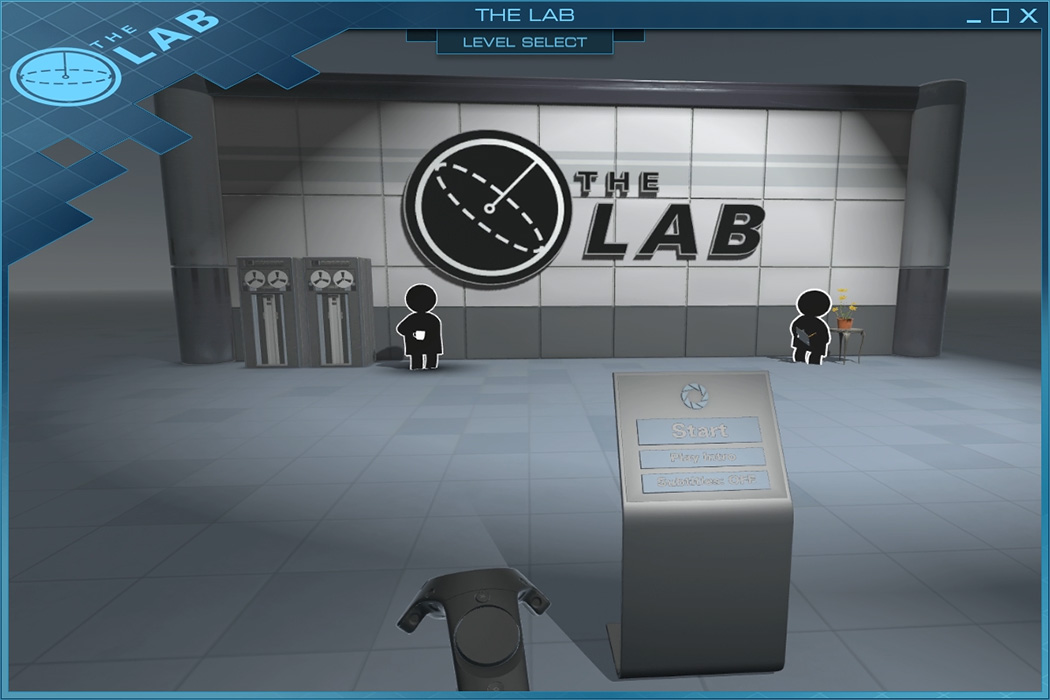
The Lab’s Start Room

This is the first room you are in when you start The Lab. I’ve seen people aim and fire at the Start Button while others recognize they’re supposed to “push” the button. How to “push” the button using the Vive controllers is usually the question they can’t answer, and I often find myself having to explain they have to use the trigger. * (1)
From the Valve Developer Commentaries I remember listening to *(2) you can learn they value interaction and mechanics training as essential for a great experience. Players learn the rules of interaction at the outset of the game or at the introduction of a new mechanic, so they don’t get confused or lost later. This first puzzle teaches you the basic interactions of the Lab and by having this room and gradually increasing complexity, players learn by doing and have an easier time progressing. By using your hands, walking around and pushing the start button, you are learning how to interact in The Lab.
The Volumetric Menu Room
The second room in The Lab is a menu, even though many people I’ve talked to don’t actually notice it. They think of it as somehow part of the game (and in many ways it is).
The current model for a menu in video games or GUI applications is a series of icons and buttons aligned in a grid where you can use your inputs to select, using your mouse and keyboard on the desktop and your fingers on mobile and tablets. Focusing on the average video game, a “Select Your Level” menu might have an icon representing each level.
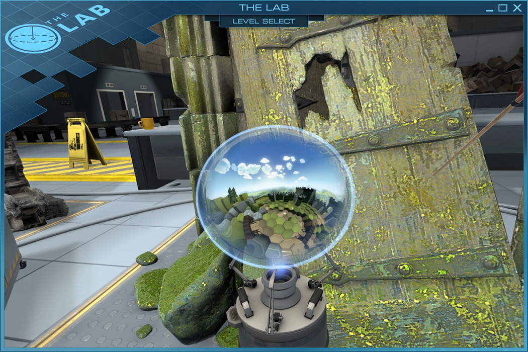
In this menu, your input and pointing device are your hand controllers. You walk around the menu, looking through icons that are fully three-dimensional, and the buttons you use are small spheres you grab and manipulate.
![]()
You have representative icons for each experience same as the design pattern we see in many video games today. For the archery experience you have an old castle door, for a photogrammetry experience of virtual tourism, we have a “photo wall” with postcards pinned to it.
The difference here is the icons are fully-detailed 3D models, but they are still icons laid out in a grid.

You also have the spherical buttons in front of the icons. These are perfectly natural if you follow first-principles thinking, which means means thinking about the fundamental forms of the medium you are working on instead of thinking through analogy, which is a form of imitation. Many VR companies, particularly 360 film companies, are still giving us menus of rectangles in a grid layout. Yet 360 video has no rectangles, it is a sphere where you can look around in all directions. Flat rectangles are poorly representative of what you’re actually clicking on, and they are an artefacts from other mediums.
Dieter Rams said that good design must be obvious, that is, good design clarifies the function of its object. In VR, everything is a form of navigable space, and because we want users to travel through disparate spaces and scenes, we need buttons and menus they can use to select where they want to go to next. We want to provide them with a Change Scene button, and we need it to be obvious and clear on first sight. Valve has found a solution for the question “How do we make a ‘Change Scene’ button in VR obvious and clear?” by making what looks like to me an magical bubble that you can see into with a 360 degree panoramic photo. They look like small spheres you can see through into another world.
Buttons need to be able to reflect three different statuses: Unselected, Pre-selected, and Selected. You can see that in Windows or OSX or Linux.

The Lab spheres do the same thing. They are Unselected when they are at rest. They are Preselected when you grab them, and you Select them by shoving them into your face.
Internally at Visualise, we talked before about moving away from flat rectangles and we considered spheres with parallax. It always seemed like a performance excess for our menus because we target mainly mobiles and performance is precious. We also couldn’t figure out how to make the parallax work well without head tracking.
Valve did a really great job with these. The 360 photo means you can see different things as you walk around them and you get the feeling you are looking into a different place through a miniature portal bubble. They’re completely intuitive and natural. After trying them out once, people just get it. The Change Scene buttons are obvious and clear. *(3)
Once you’re inside of any experience in The Lab you also are two interactions away from going to the main menu. If you push the menu button on the Vive controllers, a sphere will pop out of it. Using it sends you back to the menu and if you don’t use it, it naturally fades away over time.
All of the interaction schemas we’re used to are still here, it’s mostly the graphical representation of them that’s changed.

Things I haven’t mentioned yet and won’t write too much about
At the top of that list of things I love about The Lab is Robot Dog. It’s really lifelike, and Valve made something really charming with this character. The fact that it engages with you so naturally, the game of fetch you can play with it, the beautiful animation, everything is so perfect, that many people I’ve introduced to The Lab lose their sense of time just playing with it. Think about what’s happening here, we are fully engaged in a relationship with a small artificial being, who only barks, comes close to you, and gets sticks back when you toss them into the distance. Great animation and character feedback are incredible in Virtual Reality.
There are many experiences to The Lab, and they often show off very interesting ideas. I won’t go over them all, as some are more successful than others. It’s worth giving them all a try and forming your own opinions.
On Design
It’s in the care for first-principles and interactive design that I think VR makers can learn the most from Valve’s The Lab. There is a lot of design by analogy going on right now in the VR space. There are dogmas coming in from other mediums. We could stop for a moment, go back to the drawing boards and think about what’s right for the medium.
Users are no longer looking at a screen, they are inside the world you’ve built. Just as they are picky about where they live, work and go for a cup of coffee, they will be picky the same way about the experiences you make for them because they will feel they are living inside them, even if for a moment. As creators, our best chance to grab them is to make the experience a great place to be in. There is a huge potential to learn from interior, industrial and graphic design, architecture and psychology on what makes great spaces, objects, and interactions. We need to get serious about these subjects if we want users to love our experiences.
Many of things I’ve outlined, like most great design, might sound obvious. When we see it, we think about how simple it really is. But someone made it that way, and it is to their credit that it is simple. These are my thoughts so far and I can’t wait to see what the incredible group of people responsible for The Lab will do next. Congratulations to everyone who worked in The Lab!

Comments
Responses
Mike says
> Our grandchildren will say: “This has no depth… It’s flat!”
Are you sure? If they wanted to, would they not be able to convert any 2D media to 3D, since the objects that appear there can easily be reconstructed by any sufficiently advanced technology?
leadingones says
If you are interested in Virtual Reality development check out
www.leadingones.com
We have free tutorials covering Unity and Unreal for Vive and Rift development.
FirstMaryann says
I have noticed you don't monetize your website, don't waste your traffic, you
can earn additional bucks every month because you've got high
quality content. If you want to know how to make extra bucks, search for:
Boorfe's tips best adsense alternative
FirstWinifred says
I have noticed you don't monetize your website,
don't waste your traffic, you can earn extra bucks every month because you've
got high quality content. If you want to know how to make extra bucks, search for: Boorfe's tips best adsense alternative